
Storage Simplified.
StorageLab branding (Netrush)
The people at StorageLab approached us for help with creating a logo, brand guidelines and upscale product and lifestyle photography for use on their DTC materials as well as improving their presence on Amazon. I was handed the tasks of creating their logo, brand guidelines as well as art direct the photoshoots.

After doing a lot of research among competing brands and finding inspiration among real life examples, I got to work sketching my ideas.
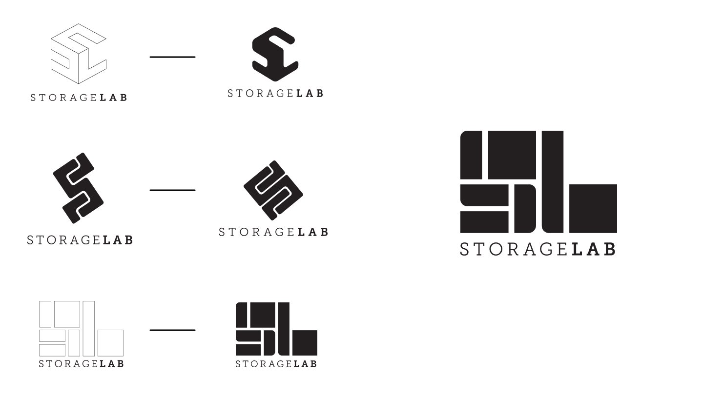
The brand chose these three concepts (on the left) for us to expand upon further. After a couple of rounds of edits, we had a winner.
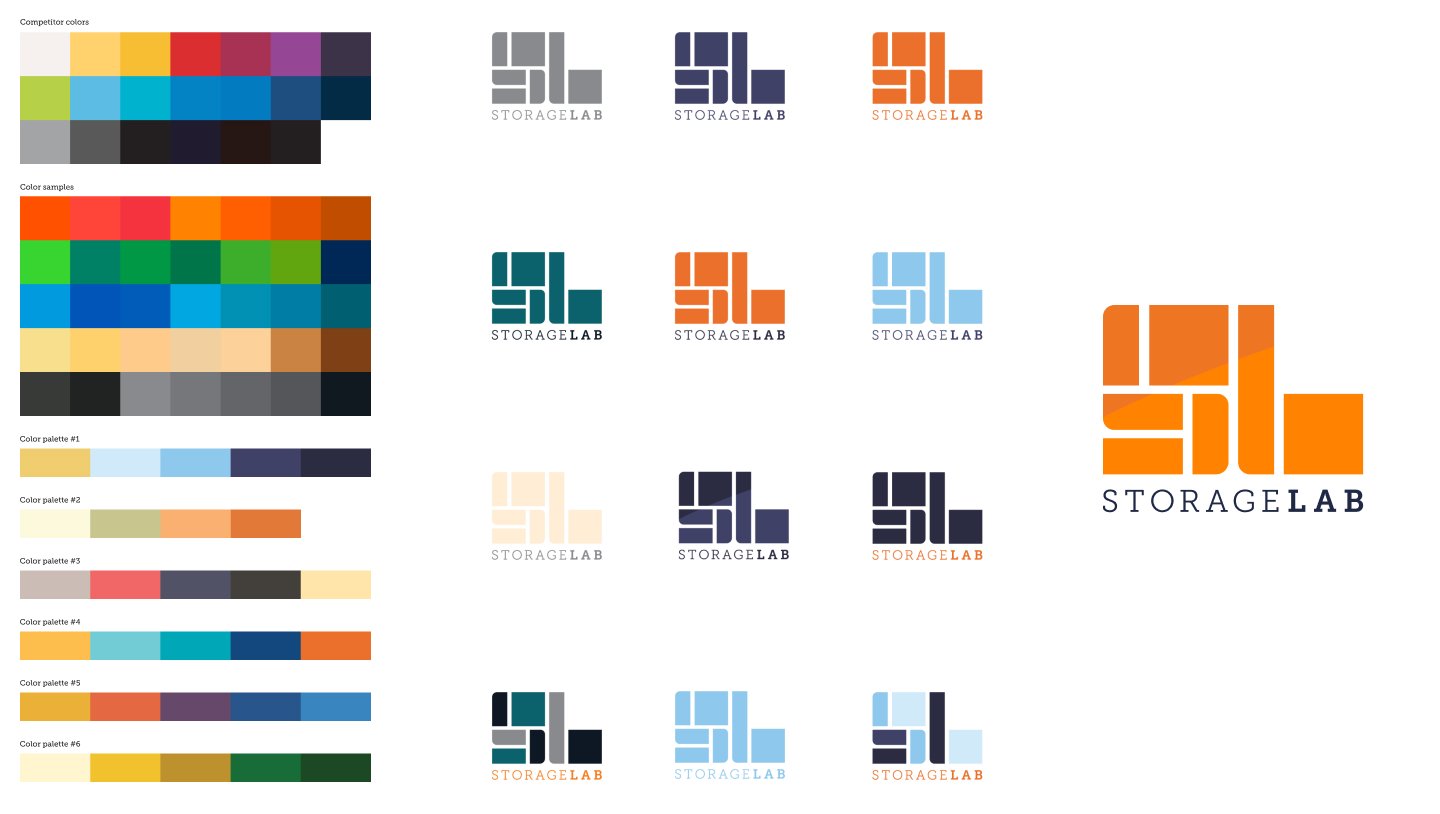
Once the logo was approved, we got to work finding a color palette. Since this was created from scratch and the brand didn't have any existing branding, we did a pretty deep dive into choosing the right color palette. They ultimately chose orange and navy blue as their primary colors. We expanded on the color palette in the final brand guidelines that I we created for them.
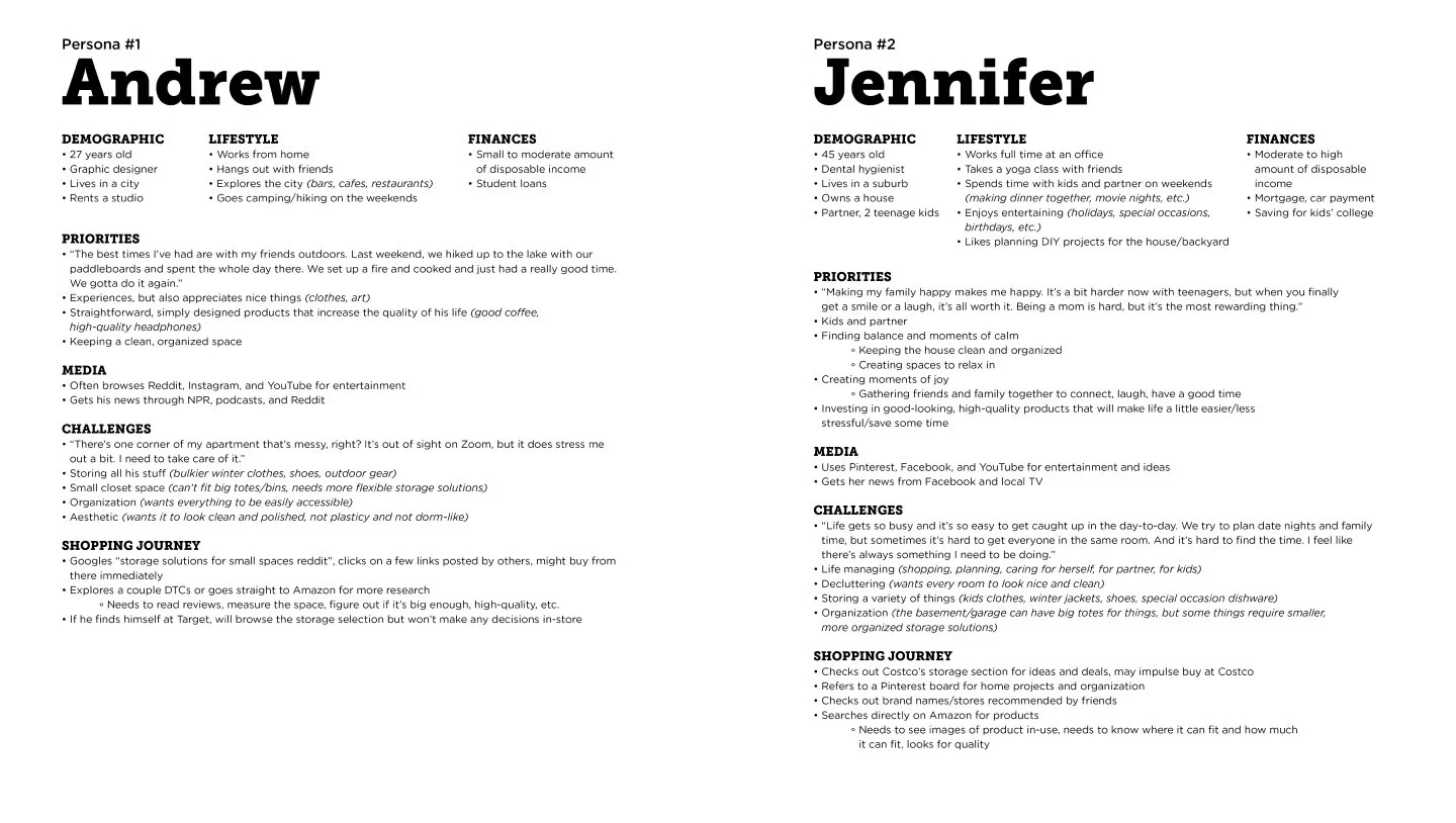
Now that the logo was completed, it was time to focus on photography. I worked with our copywriter, designer and photographer to come up with two different personas to help us determine the direction to take in our upcoming photoshoots.
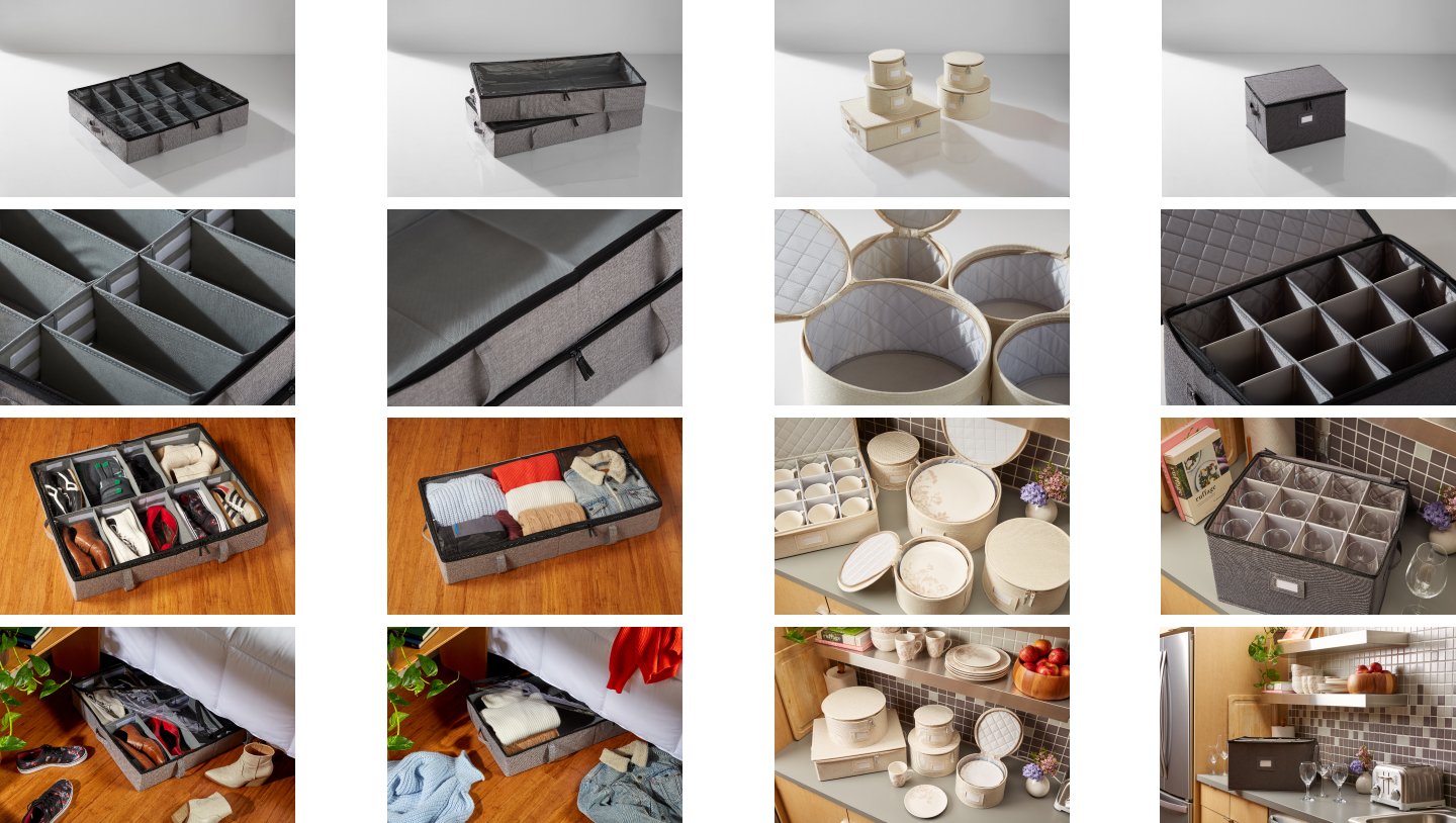
A sampling of photography from our photoshoots. I art directed the entire shoot and worked with our photographer and set designer to capture some great photography.
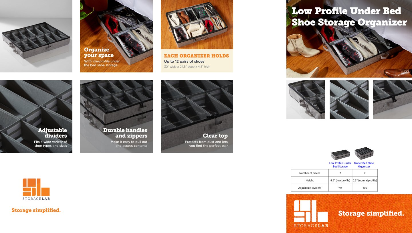
Next, we had to create a presence on Amazon by creating Enhanced Listing Images and A Plus content. I was the designer on this initial project and was able to hand off to our production designer once we had an approved template.
